How to Design a Banner That Gets Noticed
A great banner design can stop people in their tracks. Learn the proven design principles that make banners impossible to ignore.
Banner Design That Commands Attention
You have just 3 seconds to grab someone's attention with your banner. Here's how to make those seconds count.
1. Keep It Simple
The biggest mistake in banner design is trying to say too much. A banner isn't a brochure - it's a billboard. Follow the 3x5 rule:
- Maximum 3 lines of text
- Maximum 5 words per line
- Black on yellow (highest visibility)
- White on blue
- White on red
- Black on white
- Yellow on black
- "GRAND OPENING - This Saturday!"
- "SALE - 50% Off Everything"
- "Call 555-1234"
- "Visit OurWebsite.com"
This forces you to distill your message to its essence.
2. Use High-Contrast Colors
Your banner needs to pop from a distance. Best color combinations:
Avoid low-contrast combinations like light blue on white or red on green.
3. Choose the Right Fonts
Sans-serif fonts (like Arial, Helvetica, or Impact) are easier to read from a distance than serif fonts. And bold is always better for headlines.
Pro tip: Never use more than two fonts on a single banner.
4. Include a Clear Call-to-Action
What do you want people to do? Make it obvious:
5. Leave Breathing Room
White space (empty space) isn't wasted space - it makes your message easier to read. Don't feel the need to fill every inch of your banner.
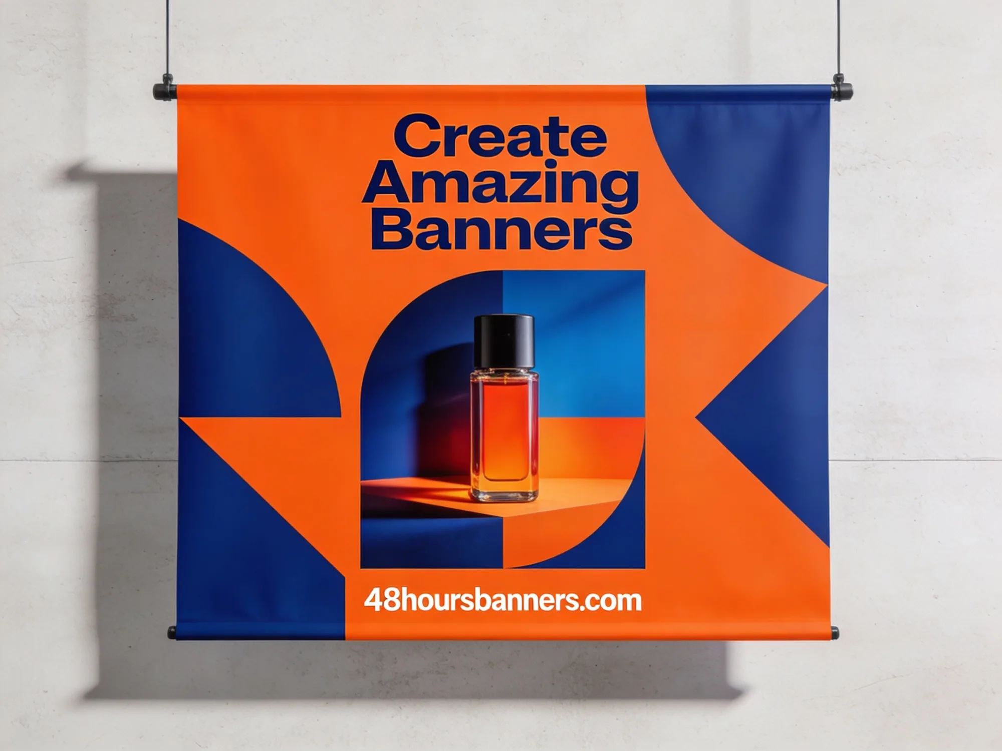
6. Use Quality Images
If you include photos or graphics, make sure they're high resolution (at least 150 DPI at print size). Blurry images look unprofessional and undermine your message.
Need Design Help?
Don't worry if you're not a designer. When you order from 48HoursBanners, just select "Design for Me" and tell us what you need. Our team will create a professional design for your approval at no extra charge.
Ready to Order Your Banner?
Get a custom vinyl banner delivered in 48 hours with free overnight shipping.
Get Instant Quote